Foodies

FOODIES REBRAND
With employees spending less and less time in the office, maintaining workplace canteens has become a major profit sink for many companies. Foodies from Selecta was designed as a cost-effective alternative. Their Micromarket offer can be tailored to suit a range of businesses and environments. It offers lots of flexibility, with a range of machines and a focus on fresh, heathly products.

A DELICIOUS FRESH FOOD EXPERIENCE
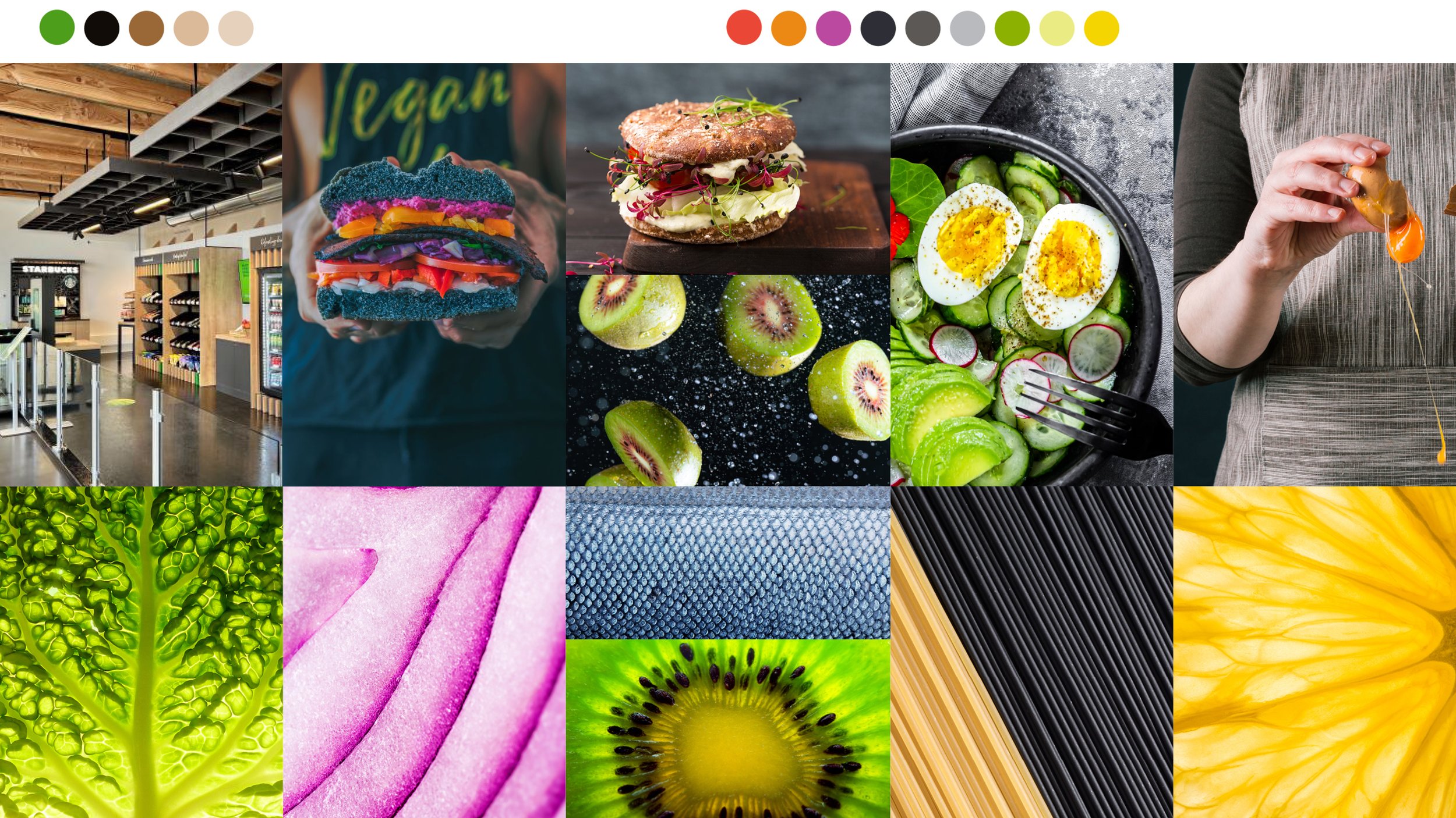
A number of visual territories were explored with special focus on fresh and healthy, and how close Foodies should be to the Selecta master brand. The colourful ‘Joy line’ was retained to create a visual link. A fresher palette across colour and photography was designed to reflect the healthy product offering. The script font was chosen to give a ‘deli’ feel to the brand.

PHOTOGRAPHY
The idea behind the photography was to give a sense of joy, fun and coming together to enjoy food, with close ups of beautiful, fresh ingredients.


COLOUR
The colour palette was inspired by the tones and materials within the Micromarket design and by the colours of the dishes and their ingredients.

LOGO DESIGN
Lettering artist Rob Clarke was brought in to create script style designs for the Foodies logo. The idea was to create a unique mark with a playful feel.


MICROMARKET
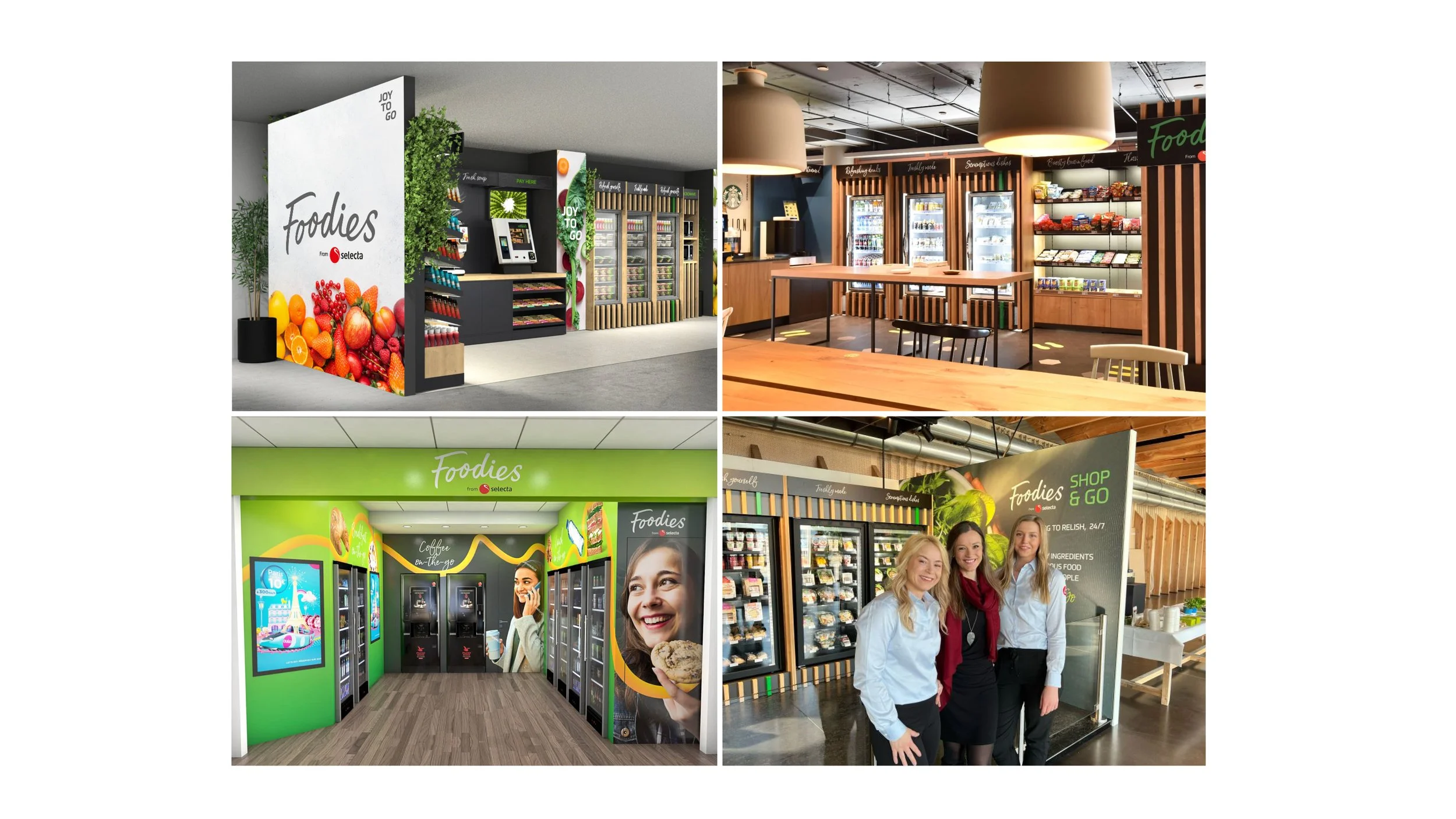
The new Micromarket design had specific areas for branding and communication. We used the palette of brand assets to enliven each space and give clear sign posting throughout.

Agency collaboration with Frank Bright & Abel